
Working on the GUI
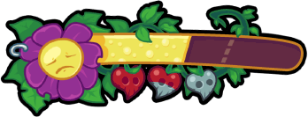
/I've been busy working on redoing the game's GUI lately. One bit of feedback we got from testing and showing people the game at GDC was that the HUD elements weren't as clear as they could be. We've basically been relying on quick mock-up programmer art for the GUI so far, and from a purely aesthetic standpoint I haven't been very happy with it. So here is the first GUI element I've created to replace the placeholder art. This element goes in the upper left corner and shows citizen happiness (the flower face and bubbly yellow meter) and player health (the little heart/skull berries).
From early on in the design process I knew I wanted to work with two conflicting graphic design styles for GUI and other design elements. General Bauhaus and the military police would be represented by a 30's and 40's screen-print style with sharp angles and earth tones reminiscent of revolutionary propaganda art from the time. In stark contrast Molly and the guerrilla gardeners would have design elements with bright colours and round organic shapes borrowing from various 60's and 70's cartooning styles.
It took me awhile to come to the exact look for these elements and it's entirely possible they may change by the time we go into production. The GG:SoR logo you see at the top of the page in the title bar was my first attempt at what I wanted, and these new GUI elements are a further evolution of that style.
For those who are interested I have a short rambling post discussing the various influences that helped me arrive at this style under the cut.
The GG design style is the result of several influences, I can't really say that all of these made it into the final design, but these were the elements floating in my mind as I sketched out ideas.

An example of a black light poster. It took forever to to find a good one of flickr.
While incredibly tacky the psychedelic black light posters of the 60's and 70's (which really need a proper wikipedia entry) I liked the bright colors on a black background pallet and that lead to my design's thick black outlines. Like a lot of psychedelic poster art I wanted to borrow and adapt some art nouveau influences for the vines and other plant elements.
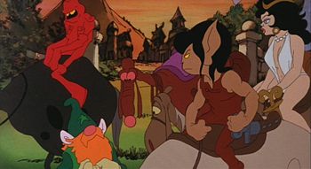
Ralph Bakshi's Wizards
The rounded shapes (eg. the teeth on the skull in the logo) were influenced by the 70's cartoon style of Wizards and similar art from that time. Though in truth probably more influenced by modern cartoonists who work in a similar style such as Brandon Graham (King City, Multiple Warheads) .

Photos I took of an Ippei Gyoubu billboard in Shibuya last year.
Another modern influence, Ippei Gyoubu is one of my favorite Japanese commercial artists. He has a bold style with bright colors that blends a 60's and 70's influence with graffiti street art elements. (some readers may recognise his style from the cult rhythm action game Cool Cool Toon on the Sega Dreamcast). His more rounded less angular stuff certainly contributed to the final look of the GG logo and GUI